Typeface Journal: Galera
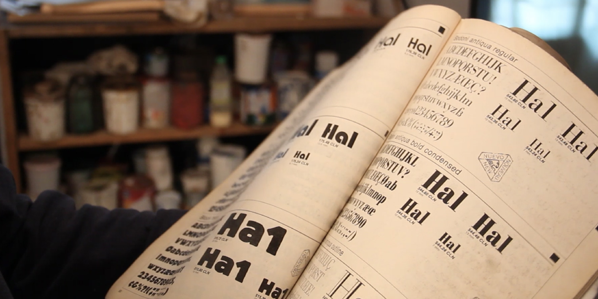
My connection to Eras® comes from a specific time and place. In Guadalajara, in the late ’80s and early ’90s, it became part of the sign painting world largely through Mecanorma® Graphic Book catalogs. These catalogs helped show clients the range of typefaces a sign painter could recreate. The transfer sheets themselves weren’t really used, but the catalogs circulated constantly, becoming a shared reference that painters adapted in their own way. I spent countless hours staring at those pages as a kid, in my father’s sign painting workshop. That’s probably where this story really begins.
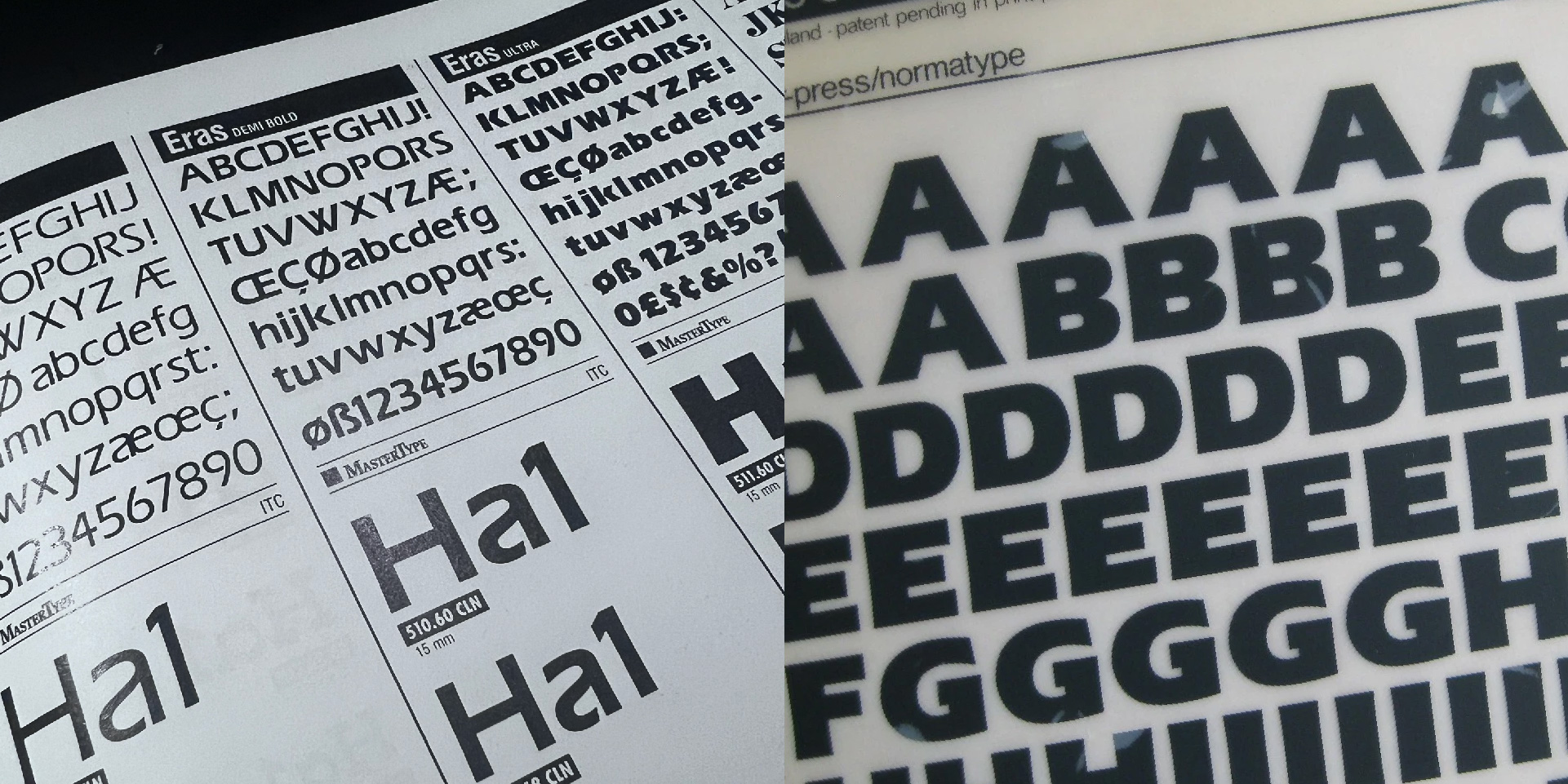
Looking back, it makes sense why Eras resonated so strongly. Its proportions, the modulation of its strokes, and especially its subtly concave stems gave it a rhythm that translated naturally to the brush. It felt solid, but not rigid, geometric, yet alive. For sign painters, it wasn’t about reproducing the typeface faithfully, but about absorbing its personality.
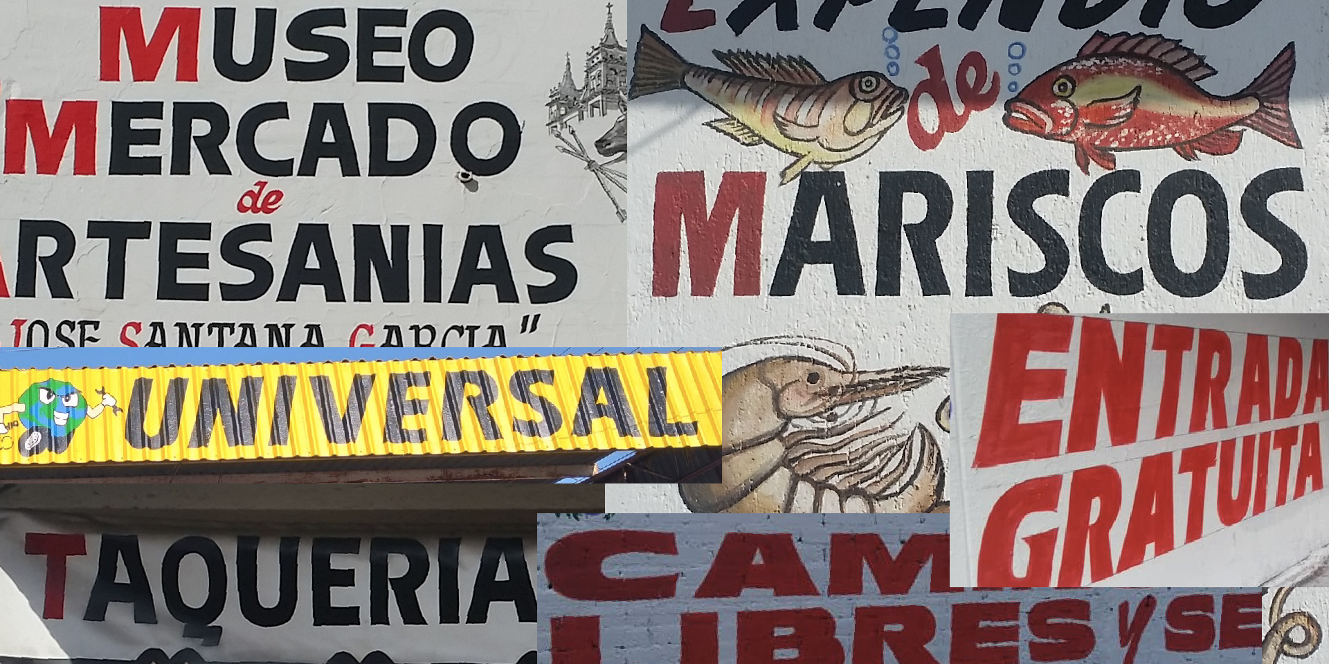
Over time, many painters, including my father, began to incorporate some of its distinctive features into their own block lettering: the open forms of the R and P, the generous proportions, the slight slant. Without necessarily naming it, Eras became part of the visual language in the local commercial areas.
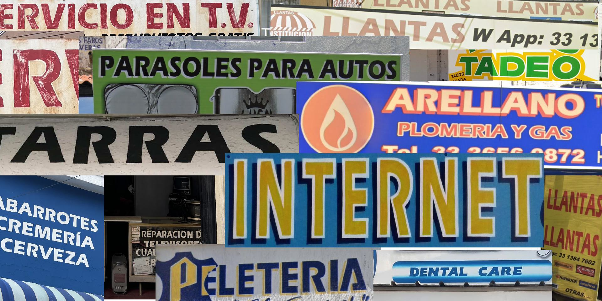
As a result, countless small businesses like hardware stores, groceries, produce stores, construction supply stores, mechanics or stationery shops ended up with signs that echoed its forms. Not quite Eras, but clearly in conversation with its letterforms.
Its visibility grew even more after its use in the 1998 FIFA World Cup branding, which helped cement its presence in Mexico. Later, as vinyl cutting and digital tools entered the trade, Eras found a second life. Its inclusion in early versions of CorelDRAW 5 ensured that it remained accessible and relevant, bridging the gap between hand-painted and digital lettering. By then, it was already embedded in the practice. It didn’t feel imported anymore, it felt familiar.
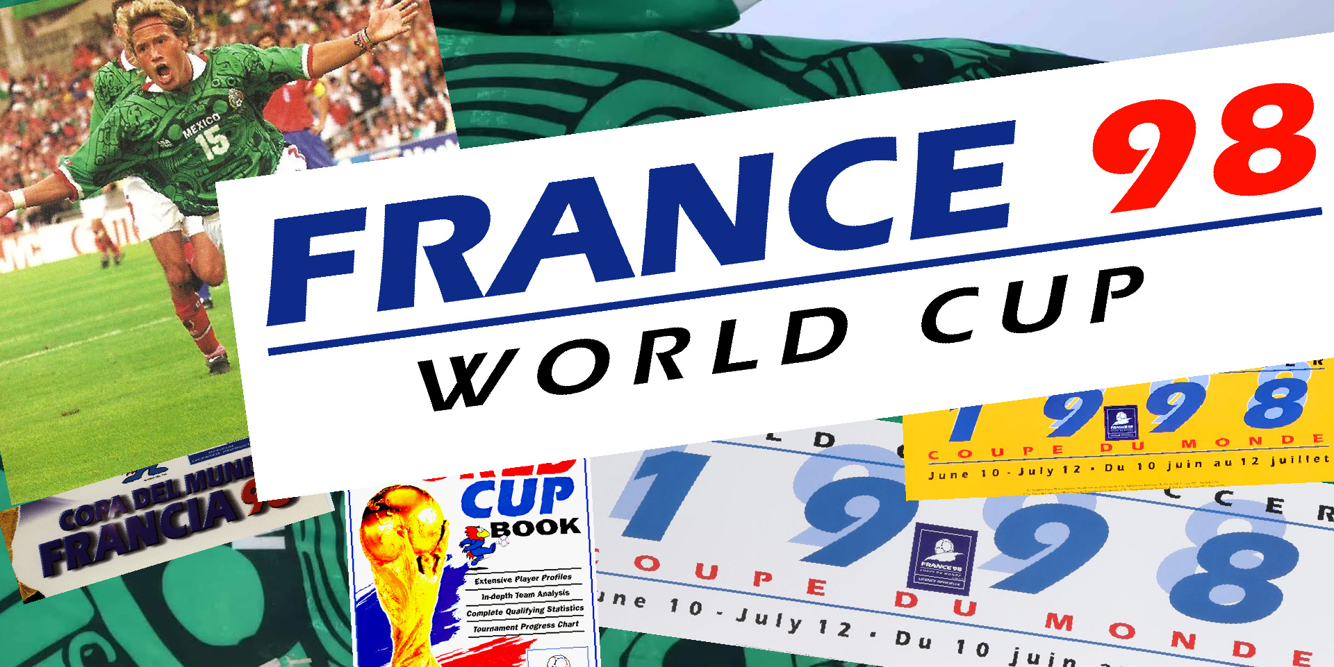
Galera comes from going back to that time, it is a conversation with the original design, informed by years of seeing it, painting it stroke by stroke, and living with it. In a way, it’s about returning to something that was always present, even before I fully understood why it mattered so much to me.
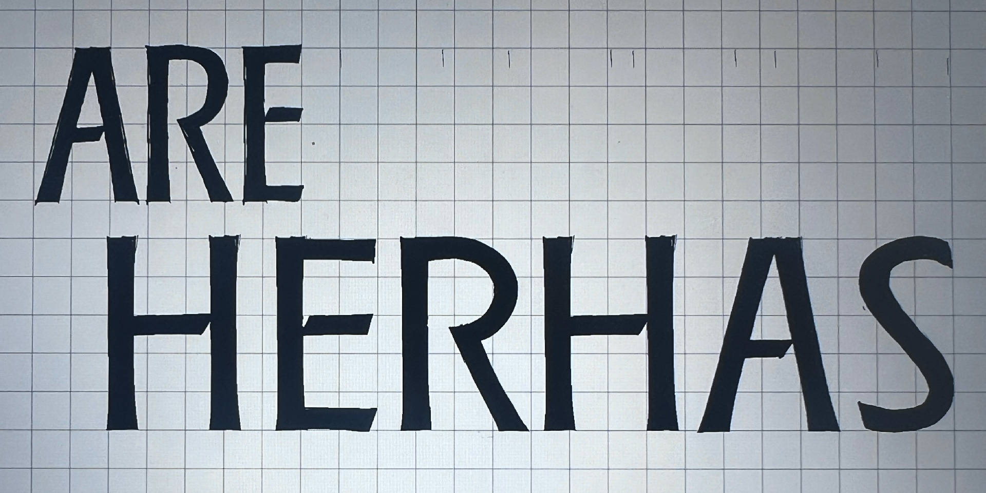
In the first sketches of Galera, I was not yet sure how far it should move away from the original design. On one hand, I wanted to make something based more directly on the letters my father had painted. But as I began inspecting several digital versions of the original typeface, I realized I was not entirely comfortable with the quality of the digitization or with some of the design decisions in the ITC versions. The character set was quite basic, and many glyphs did not even seem to belong to the same typographic voice.
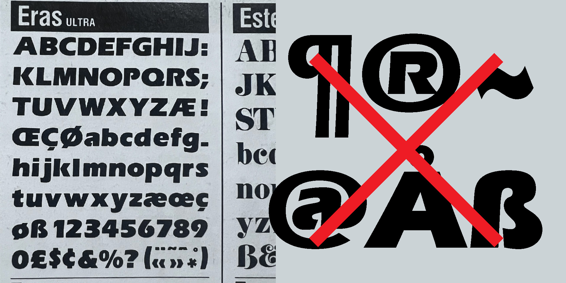
That was the moment when I decided to draw my own version: one that could tell a story close to the original, but with my own voice. Rather than making a strict revival, I wanted to make an interpretation.
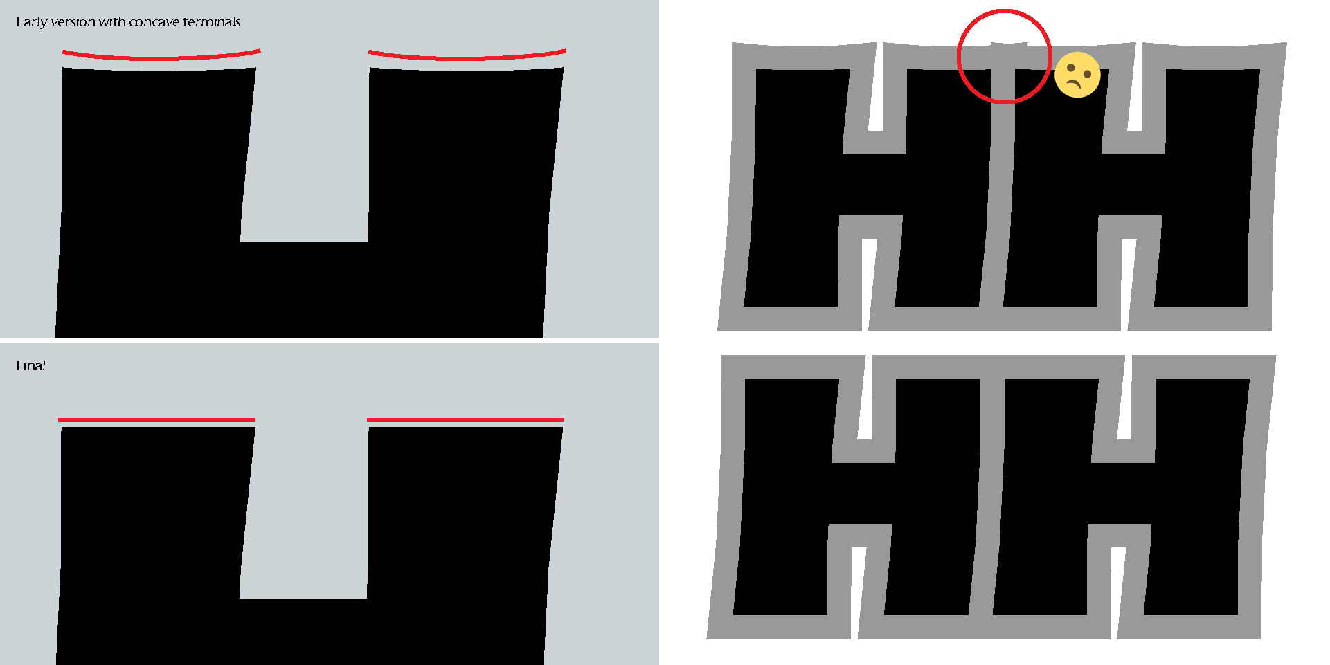
In this interpretation, I tried to bring together two ideas that may seem contradictory. I wanted Galera to feel more rational and refined, but also to retain clear traces of manual craft and brushwork. Some of those gestures, although I loved them, eventually had to be removed. One example was the concave terminals. They looked fantastic at very large sizes, but became almost imperceptible at medium sizes. And since I wanted the typeface to work well for logos, digital use, and possible graphic effects, those terminals created more problems than advantages. In the end, removing them did not change anything essential about the design, and it made production and digital hinting much more straightforward.
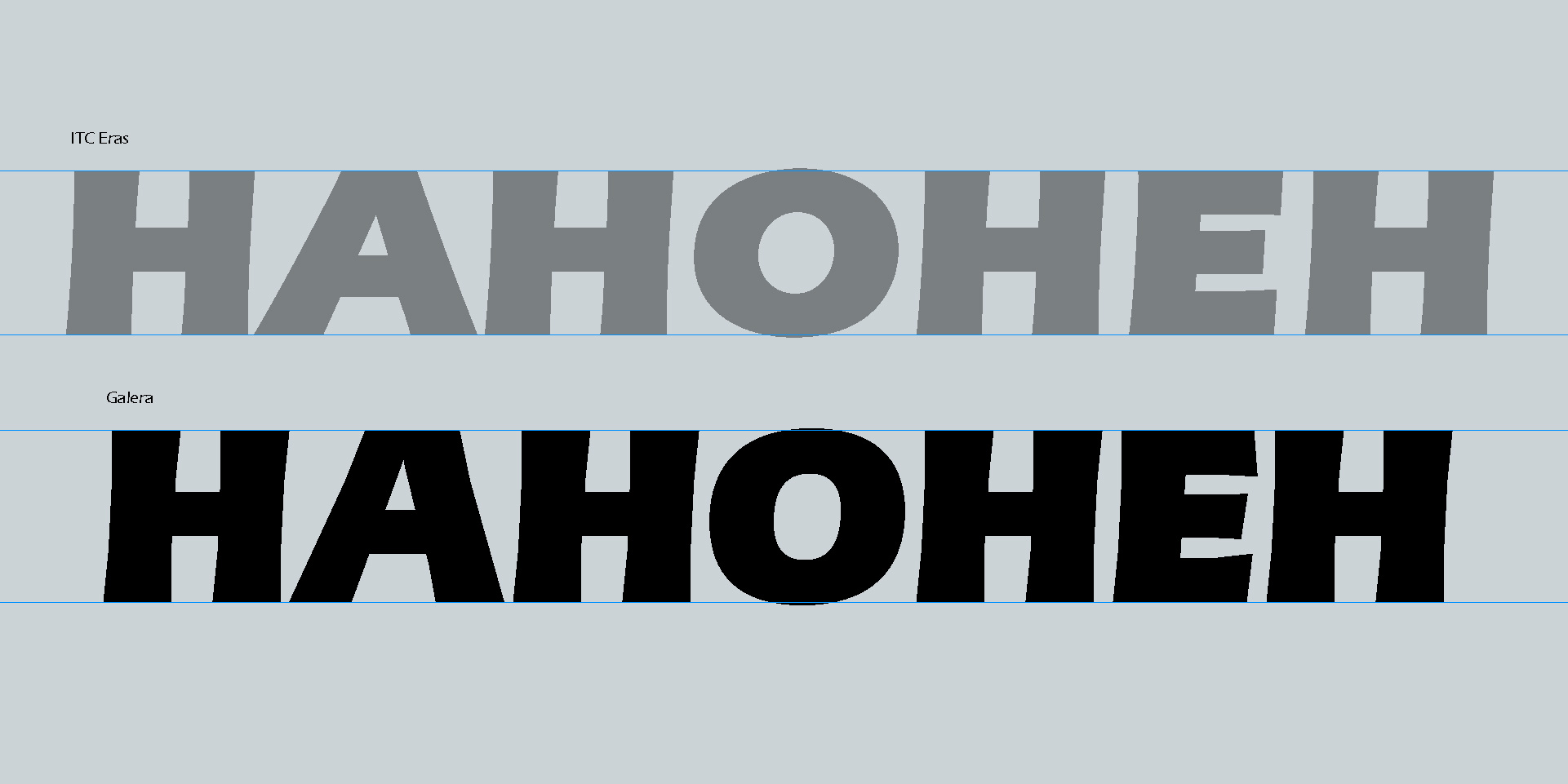
Another important decision was the change in proportions. The original reference has somewhat extreme proportions, especially in the very wide O and A. While I understand their connection to classical Roman proportions, I felt that this structure was not always consistent across the different styles, and at times it felt too extreme. For that reason, I decided to establish a more measured proportional system. At first, I was afraid that moderating the proportions would take away some of the charm. But in the end, I think it was the right decision.
Galera is not an attempt to replace Eras, or to correct it. It is a way of continuing a conversation with a design that shaped my visual memory, my understanding of letters, and my connection to sign painting. It carries some of that history, but it also accepts the distance that comes with reinterpretation. What began as nostalgia became a way to look more carefully at form, memory, and craft, and to give those influences a new place in a contemporary type family.
Eras® is a registered trademark of Monotype ITC Inc. Galera is an independent typeface project inspired by historical and personal references, and is not affiliated with, endorsed by, or sponsored by the trademark owner. All other trademarks mentioned are the property of their respective owners.
Thanks to Kel Troughton for the shared photos.